Label
Label
Note: The use of certain controls or the configuration of certain properties may require programming knowledge to create scripts that control their behavior. When editing templates used in the system, be careful not to delete controls or improperly edit their properties, since this could cause errors when generating the final report.
The following controls are available in the Tool Box window.
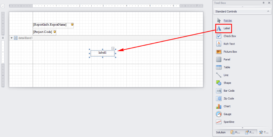
Label
The Label control allows single lines of text to be included in the report, which can be used to label figures and tables or to write text that does not require formatting (for formatted texts, see the Rich Text control further ahead). Text can be statically entered by the editor or read dynamically from a data source configured for the report.
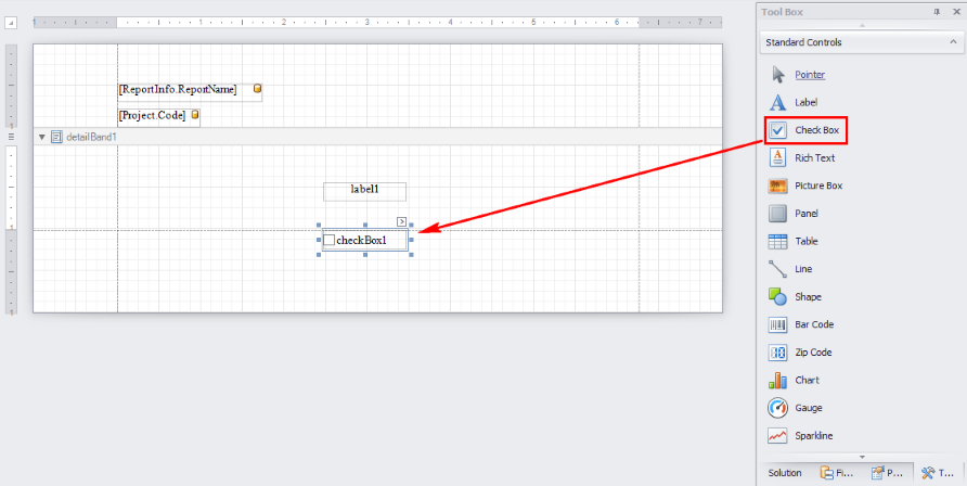
 Checkbox
The Checkbox control creates a standard checkbox, which can be used to control a "True/False" or "Selected/Deselected" state in a report. The control’s behavior can be programmed through scripts (see the Scripts property in the Behavior group from the Property Grid window).
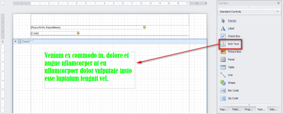
 Rich Text
This control is used to register text that requires formatting. These fields may contain static content entered manually or dynamic content automatically completed with data from a certain data source. In the example shown below, the text for a Rich Text control was entered manually by editing its Text property in the Property Grid window. Note that in the Font section of properties under the Appearance group, various formatting features can be applied to the text (bold, underline, italics, etc.), the font and font size can be specified, the color of the text and background color can be selected, etc.
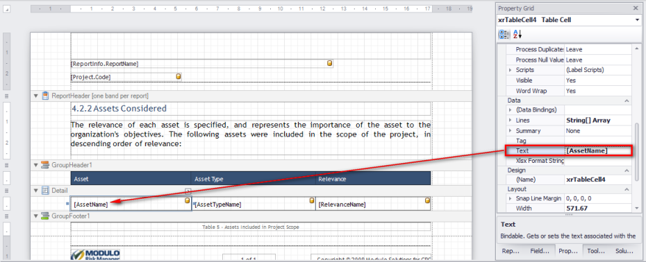
An example of a Rich Text control being completed automatically is shown below. The text of a control included in the Detail band of one of the report templates will automatically (when a report based on this template is generated) display the value of the field whose name is AssetName, which stores the name of an asset that was analyzed in a risk management project.
 Picture
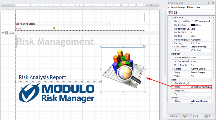
This control allows images to be included in the template. It can be used to include your organization’s logo, for example, on the cover of the reports provided by Modulo. Different images formats are supported (BMP, JPEG, GIF, or PNG). Through the control’s properties, you can control the image’s appearance (background color, border, border width, etc.), its behavior (visible, invisible, associated scripts), the data source (manual, database, dimensions, tags, etc.), layout (position, alignment, etc.), and other features.
 Panel
Panel
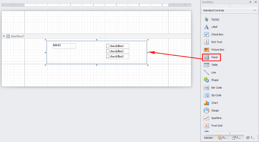
This control displays a panel which is used to organize other related controls, making them easier to manage. The figure below shows a Panel control whose background color was changed to grey and which groups four other controls (one Label control and three Check Box controls. Note that in most use cases the behavior of these controls must be programmed.
Note: When a Panel control is deleted from a report template, all other controls included in it are also deleted.
 Table
Table
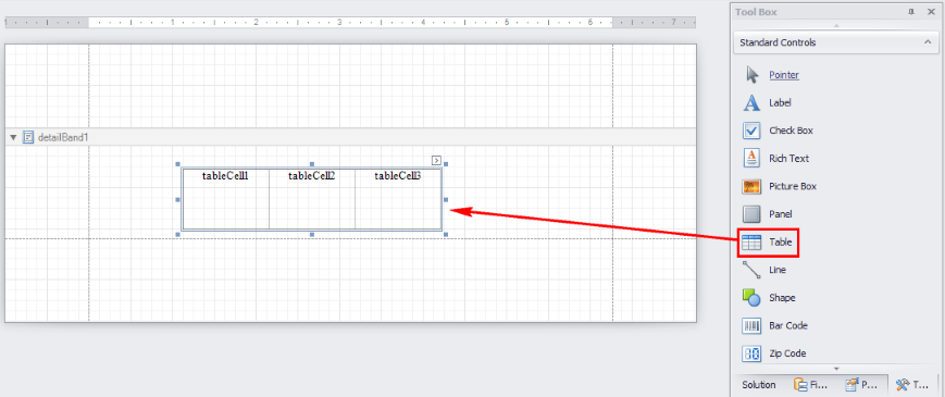
This control allows a table to be included in the template, which is useful if you need to show data in tabular format.
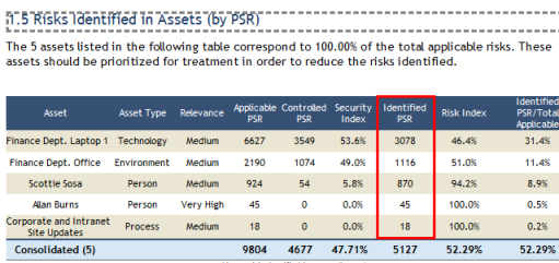
In practice, the contents of Table control cell shown in the templates are completed automatically through calculated fields when a report is generated. In the figure below, the GroupHeader band contains a table whose column header cells were completed manually with text. One of the cells from this column (Identified Risk (PSR)) will be completed automatically with the value of the [IdentifiedRisk] field. This field stores the total PSR score of the risk identified for one of the asset types analyzed in a risk management project.
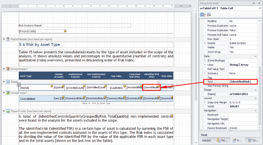
When the report is generated, the value calculated for the [IdentifiedRisk] field will be entered in the cell, and this section will then appear in the final report. In addition, the tables can be configured so that the data displayed in them is ordered by column. This is configured through the Add a Sort option at the bottom of the window (see figure below).
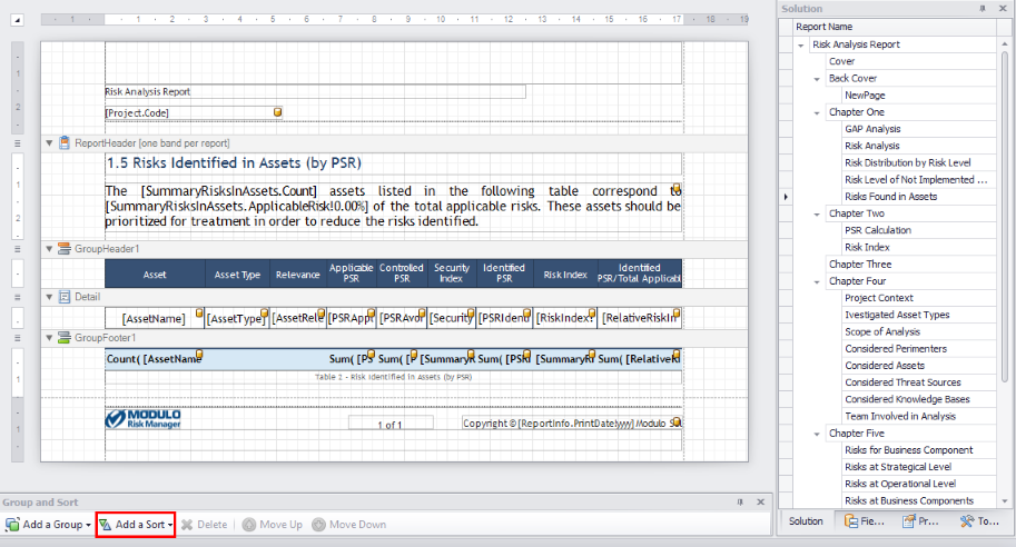
This option displays all available columns in the table selected and allows one of them to be selected so that the data in the table can be ordered by the chosen column (see figure below).
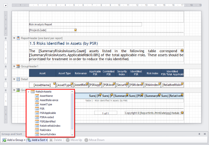
The following figure displays a table where the risks identified in assets can be ordered by the PSR score. This is possible because the ([PSRIdentified]) column was selected through the Add a Sort option.
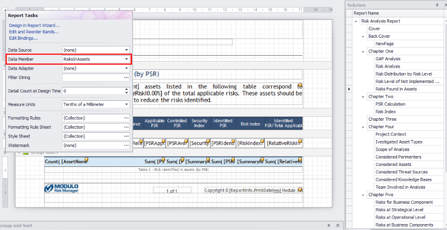
Note 1: For the columns in the table to be displayed correctly in the Add a Sort option, the name of the table that was inserted in the report template must be selected in the Data Member field of Report Tasks window (see figure below).
Note 2: To sort a table by the values of a column without having to link a table to the report in Report Tasks, you can use the Sort Fields property. To do so, click the arrow in the upper right corner of the band where the table is located and, in the Sort Fields field, click …. In the GroupField Collection Editor window, click Add. In GroupField Properties, select the column by which the table will be sorted and, in Sort Order, select Ascending or Descending.
 Line
Line
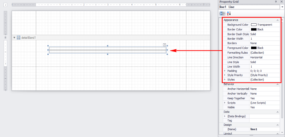
Allows horizontal, vertical, or diagonal lines to be included in the report. The figure below shows an example of the use of a Line control in one of the report templates. Note that the line’s style (solid, dotted, etc.) can be configured in the Property Grid window in the Line Style property of the Appearance group. Several other properties are available, allowing its color, background color, borders, direction (horizontal, vertical, inclined), and width to be configured.
 Shape
Shape
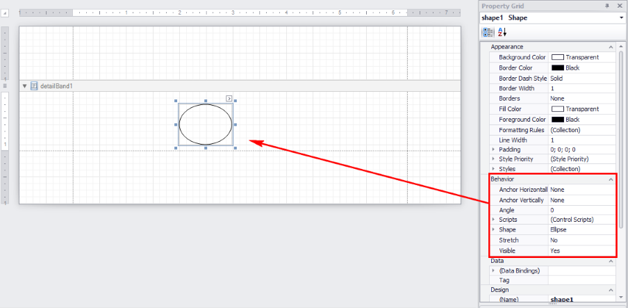
Allows simple shapes to be included in the report, such as circles, ellipses, triangles, and arrows. The type of shape can be specified in the Shape property of the Behavior group, as shown below.
 Bar Code
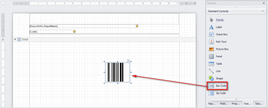
This control allows different types of bar codes to be included in the report. As with other controls, the properties of a Bar Code control can be configured in the Property Grid window once it has been included in a band.
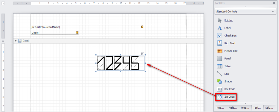
 Zip Code
This control allows a zip code to be included in the report, comprised of numbers and dashes. The information can be entered manually in the Property Grid window under the Text property of the Data group of control properties.
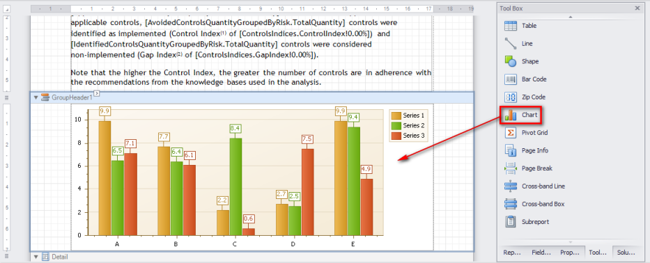
 Chart
Chart
The Chart control is very handy and can be used to represent report data through various types of charts. In general, the chart data is obtained dynamically through queries to database tables that were previously linked to the report.
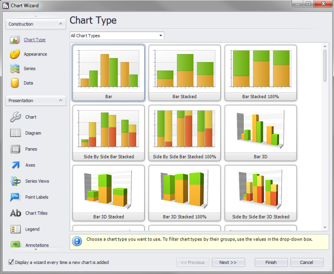
When this control is dragged to the editing area, a wizard is displayed which allows you to select the type of chart you want to add (see figure below). There are several chart types available, including bar, point, line, and pie charts, some of which are available both in 2D and 3D format. In the Construction tab of the wizard, you can select the type of chart, its appearance, the data series you want to show graphically, and the source that will provide the data for the report. Options are also available for the chart’s appearance in the Presentation window, allowing various properties to be customized, such as color, background color, captions, margins, axes, panels, titles, notes, and others.
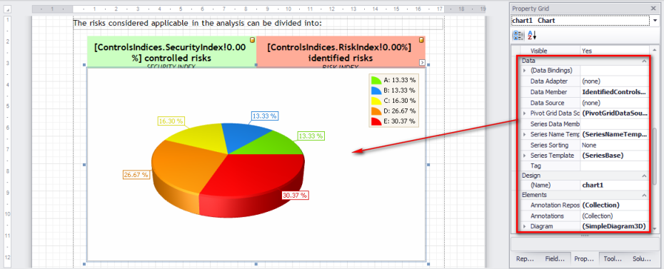
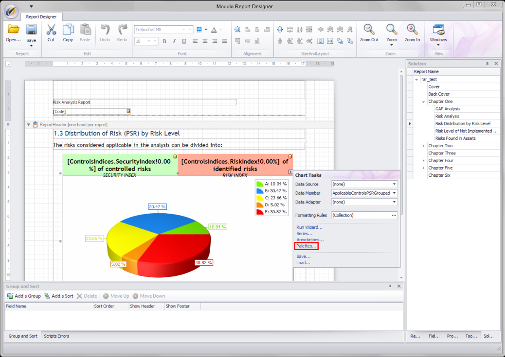
In real use scenarios, the data to be displayed in the chart will be read dynamically from some data source configured for the report. For example, in the "Distribution of Risk by Risk Level" pie chart shown below, the data sources used to generate the chart are specified in the Data group of the Property Grid window.
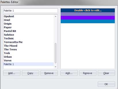
Once included in the report, charts can be edited by clicking the arrow in the upper right corner or by selecting the chart and clicking the Property Grid window. To change the color scheme for a chart, for example, simply click the arrow and select Palettes (see figures below). Another color palette can be selected, or you can create a new one by clicking Add and adding colors to the palette. By clicking the arrow and selecting the Run Wizard… option, you can view the chart editor where the properties of the chart were chosen when it was being created.
 Pivot Grid
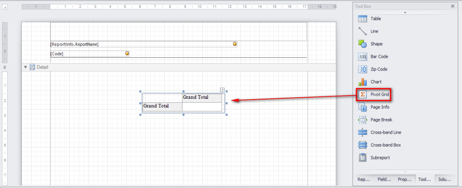
This control allows tables to be included in the report. It offers various important features, such as the ability to include various types of totals for numeric fields containing a variety of pre-defined statistics (sum, average, total, minimum, maximum, standard deviation, variance, etc.).
When using the Pivot Grid control, it’s important to understand the idea of a field, which is an element a user can manipulate in the table and is visually represented by a box (field header).
To allow data that will be included in the table to be better organized and presented, each field included in the Pivot Grid control can be dragged to one of the four different areas of the control, namely:
•A column’s header area
•A row’s header area
•A data area
•A filter header area
The fields position in these areas of the Pivot Grid are called column fields, line fields, data fields, and filter fields, respectively.
 Page Info
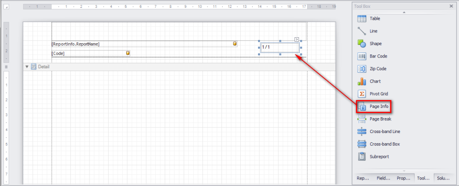
This control allows page information to be included in the report, such as the current date, page numbers, or user information.
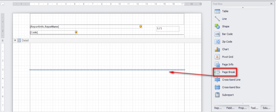
 Page Break
This control is used to mark the place where a report should start a new page. You can also use the Band.PageBreak property to break a page just before or after a particular band.