This topic explains how to establish a SQL connection and write the query that will be run to assemble a custom chart that can be included in a dashboard. This type of query is run every time the chart is loaded or refreshed and thus does not depend on the schedule set for the integration task with the Dashboard module, as other charts do.
An exception is if the data source selected for the query is the Dashboard module or the Intelligence solution databases, which contain the same data as the system only structured specifically to facilitate use in charts. SQL queries using the Dashboard module as a data source will be run according to the schedule set for the integration tasks with the module, while queries using the Intelligence solution database will be run according to the schedule set for the tasks to extract and process intelligence data. Another exception are query results exported to SQL tables through integration tasks, as these will also be run on the schedule set for the tasks. For details on integration tasks, see Chapter 17: Administration -> Integrations -> Integration Tasks.
1. Access the Dashboard module.
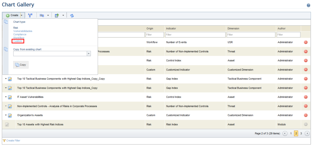
2. Select List Charts from the Chart Gallery option on the menu.
3. In the Chart Gallery section, click Create and select Custom from the drop-down menu that appears (see figure below).
The system displays the Customized Query step, where the data source, the type of SQL query, and the query itself can be entered (see figure below). This step is required.
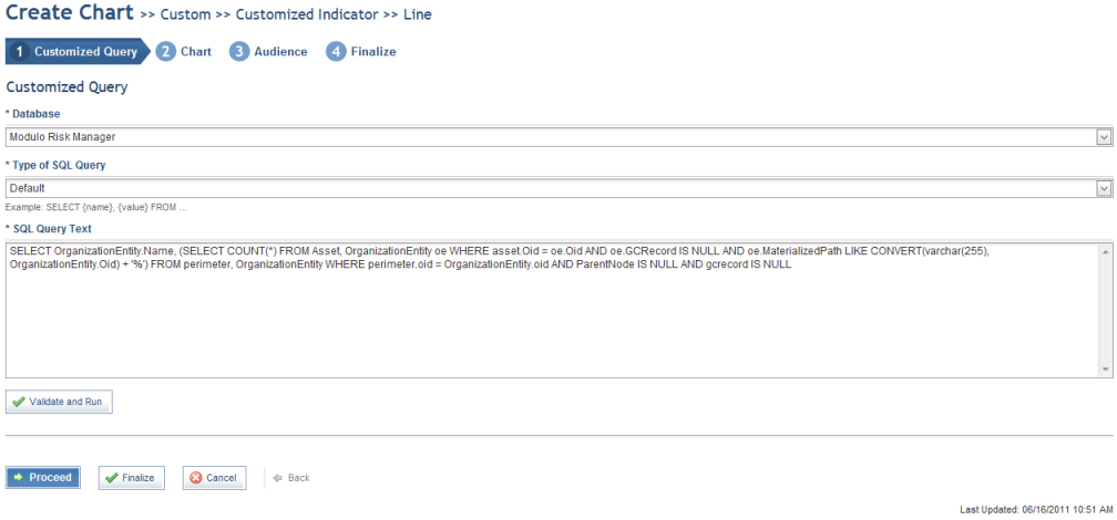
4. In the Database field, select the data source for the query. The options available include the system database, the Dashboard module database, an external MS SQL Server database, an external Oracle database, and the Intelligence Data database. For details on extracting intelligence data and data used in the Dashboard module, see Chapter 17: Administration -> Integrations -> Integration Tasks.
5. If a MS SQL Server or Oracle database is selected, enter the connection string to connect to the database in the Connection String field that appears and click Test Connection to ensure the connection string is valid. The connection string is encrypted in the database and will not be displayed when the chart is edited. The connection string fields are listed below. For more information on access data, please contact your system administrator.
Note: If the MS SQL Server database is selected, the connection string for the SQL Server can be for a standard SQL Server or for an instance. For example:
Connection string for a standard server: Server=myServerAddress; Database=myDataBase; User Id=myUsername; Password=myPassword;
Connection string for a server instance: Server=myServerName\myInstanceName; Database=myDataBase; User ID=myUsername; Password=myPassword;
If the Oracle database is selected, the Oracle connection string can be the one that does not use the tnsnames.ora file or the alternative. For example:
Connection string without tnsnames.ora: SERVER=(DESCRIPTION=(ADDRESS=(PROTOCOL=TCP)(HOST=MyHost)(PORT=MyPort))(CONNECT_DATA=(SERVICE_NAME=MyOracleSID))); uid=myUsername; pwd=myPassword;
Alternative connection string omitting tnsnames.ora: DataSource=(DESCRIPTION=(ADDRESS=PROTOCOL=TCP)(HOST=MyHost)(PORT=MyPort))(CONNECT_DATA=(SERVICE_NAME=MyOracleSID))); User Id=myUsername; Password=myPassword;
6. Select the type of query in the Type of SQL Query field. The options are:
•Default: shows two types of information – a name and a value. For example: SELECT {name}, {value} FROM...
•With identifier: shows three types of information – an identifier, a name, and a value. For example: SELECT {identifier}, {name}, {value} FROM... The identifier is used to view additional chart details.
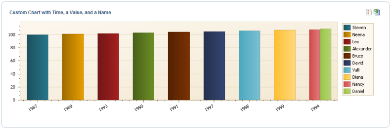
•With time: shows three types of information – a name, a time, and a value. For example: SELECT {name}, {date}, {value}, FROM...
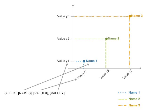
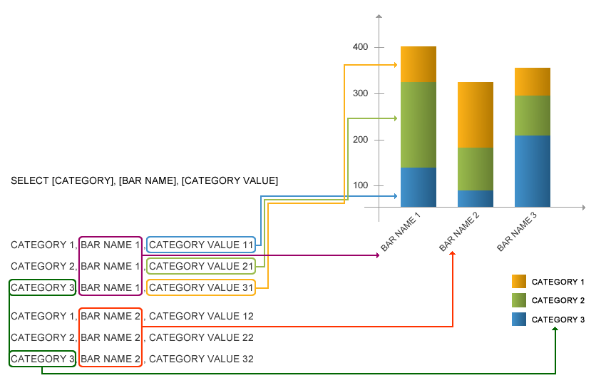
•With three values: shows three types of information – a name, an x value, and a y value. This type of query can use stacked bar and scatterplot charts. An example of a query for a scatterplot chart is: SELECT {name}, {value X}, {value Y} FROM… An example of a query for a stacked bar chart is: SELECT {category}, {bar name}, {category value} FROM…
•With three values and an identifier: shows four types of information – an identifier, a name, an x value, and a y value. This type of query can use stacked bar and scatterplot charts. An example of a query for a scatterplot chart is: SELECT {name}, {value X}, {value Y} FROM… An example of a query for a stacked bar chart is: SELECT {category}, {bar name}, {category value} FROM…
Note: For more information on the chart types can be used for each type of SQL query, see Chapter 9: Dashboard -> Chart Gallery -> Chart Types.
The figure below illustrates the relationship between parts in a SQL query and how this information is displayed through a scatterplot chart.
The figure below illustrates the relationship between parts in a SQL query and how this information is displayed through a stacked bar chart.
Note: The query must return exactly the number of types of information specified in the type of query (default, with identifier, with time, with three values, or with three values and an identifier), and the order must also be followed precisely. If an error is displayed when viewing the chart in a dashboard, it is likely that one of these restrictions were not met. See the figure below for an example of a chart with a name, a time, and a value shown for each entry.
7. In the SQL Query Text field, enter the SQL query that will be run to generate data to be displayed in the chart.
8. Click Validate and Run to validate the query.
If no errors are found, the system displays a success message and indicates the number of entries that will be displayed in the chart. This number will help you decide if there are too many entries to comfortably fit the chart or dashboard to be used and if the query needs to be rewritten.
9. If the type of query you are creating includes an identifier, you can specify a drill-down URL to be used in the Drill-Down URL field. The link entered can show further details on a specific object when it is clicked on a chart. The information on this object will be pulled dynamically from the link entered in this field using the identifier. For example, projects in the system are referenced by the following URL: https://modulo.com/RM_EN/Risk/Project/PRJR11027, with the last portion of the URL indicating the project code. To display details on a project when one is clicked on a chart, the drill-down URL would be: https://modulo.com/RM_EN/Risk/Project/{id}.
10. Click Proceed to continue. If you want to quit the operation, click Cancel.
The system displays the Chart step, where the format and characteristics of the chart being created can be selected (see figure below). This step is required.

11. In the Select Chart Type section, select the type of chart you want to create. Keep in mind that the types available here vary according to the type of SQL query used. For details, see Chapter 9: Dashboard -> Chart Gallery -> Chart Types.
In the Customize Chart section, you can personalize the chart using the options available.
12. In the Palette section, select the color palette to be used by the chart. Click Manage Palettes to manage the palettes available.
The system displays a window where color palettes can be created, edited, or deleted.
13. To create a new palette, click Create Palette.
The system displays a section where the properties and colors of the new palette can be defined (see figure below).
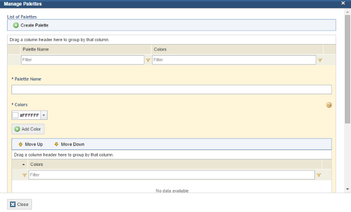
14. In the Palette Name field, enter a name for the new color palette.
15. In the Colors section, select a color from the drop-down list or enter the hexadecimal code of the color you want to add and click Add Color.
16. To rearrange the colors in the palette, click Move Up and Move Down.
17. To save the color palette, click Save.
18. To edit a color palette, click Edit next to its name.
19. To delete a color palette, click Delete next to its name. Note that palettes are available to all users who have permission to create and edit charts. In addition, if a palette that is being used in a chart is deleted, the chart will use the default color palette.
20. When finished customizing the color palettes, click Close.
21. Mark the Caption checkbox if you want an explanatory text to be displayed with the chart.
22. Mark the Label checkbox if you want the values for each item on the chart to be displayed. The Percentage and Absolute options allow you to choose how these values are displayed.
Note: The Top N option is not available for custom charts since the number of objects to be displayed can be set when the query is created.
23. Click Proceed to continue. To save the chart, click Finish. To return to the previous step, click Back. If you want to quit the operation, click Cancel.
The system displays the Audience step, where you can select the people and groups of people authorized to view, with the same permissions as the author, and add this chart to a dashboard (see figure below). This step is optional. Keep in mind that these people and groups must be included in the Dashboard Module Users Profile in order to access the module.
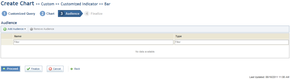
24. Click Add Audience and select People or Groups to add them.
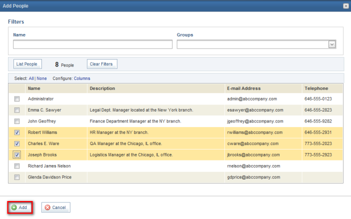
25. Select the people or groups to be added in the window that appears and click Add (see figure below).
26. To remove people from the audience, mark the checkboxes next to them and click Remove Audience.
The system requests confirmation to remove the people or groups selected from the audience (see figure below).
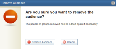
27. Click Remove Audience to confirm. If you want to quit the operation, click Cancel.
28. Click Proceed to continue. To finish, click Finalize. To return to the previous step, click Back. If you want to quit the operation, click Cancel.
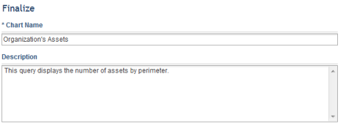
The system displays the Finalize step, where you can enter a name to identify the chart under the Chart Name field and enter information to describe the chart under the Description field (see figure below).
29. When finished, click Publish Chart. To return to the previous step, click Back. If you want to quit the operation, click Cancel.
The system displays a success message, and the new chart will be available in the Chart Gallery section of the Dashboard module.