1. Access the Dashboard module.
2. Select List Charts from the Chart Gallery option on the menu.
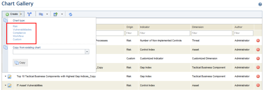
3. In the Chart Gallery section, click Create and select the type of chart you want to create (see figure below).
Note: The charts that can be created are:
•Risk: displays the risk indicator selected when the chart is created, according to the analysis results from a specific project or for the organization as a whole, considering information from the latest closed questionnaires.
•Vulnerability: displays the vulnerability indicator selected when creating the chart, according to the last time the assets were processed in a specific project or for the organization as a whole.
•Compliance: displays the indicator selected when the chart is created, according to the analysis results from a specific project, considering information from the latest finalized interviews.
•Workflow: displays the number of events from the Workflow module according to the dimension selected.
•Custom: displays custom information using a SQL query. For more information on custom charts, see Chapter 9: Dashboard -> Chart Gallery -> How to Create a Custom Chart.
The system displays the Measures step, where the indicator, dimension, and the scope of the chart can be selected (see figure below). This step is required.
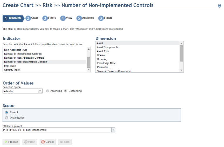
4. Select the indicator to be used in the Indicator section. This represents the metric that will be displayed in the chart.
5. Select the dimension to be used in the Dimension section, which represents the object that will be displayed according to the metric selected in the Indicator section.
6. In the Order of Values section, determine how chart data will be plotted: in ascending or descending order according to the indicator or the dimension.
7. Select the scope for the chart in the Scope section.
Note 1: If a project is selected for the scope of the chart, the data shown in the chart will reflect the latest results from the project. For risk charts, if no questionnaire has been closed for a certain project, the chart will not display data and will later be updated as questionnaires are answered and closed. For vulnerability charts, data will only be displayed once the analyses of vulnerabilities have been closed in a risk project. For compliance charts, if no interviews have been completed, the chart will not display data and will later be updated as the interviews are answered. This data will be updated according to the schedule set in the integration task.
Note 2: If the organization is selected for the scope of a risk or vulnerability chart, the data shown in the chart will reflect the latest results from closed questionnaires or the latest processing of vulnerabilities in projects. There are three options:
•Current Status: displays the current status of the indicator and dimension selected. A dynamic chart is generated, since any changes in the projects will be reflected once the integration task is run.
•Status on: displays the status of the indicator and dimension selected at a certain date. This produces a chart that is static in time, since it considers a pre-established date.
•Historical Series: displays the evolution of the indicator and dimension selected over a certain period. These can be displayed on a monthly, quarterly, biannual, or annual basis over dynamic or fixed periods. The used in risk charts will correspond to when the last questionnaire was closed, whereas vulnerability charts will display the date when the vulnerabilities were processed.
Note 3: There are three options for the scope of charts for events from the Workflow module:
•Current Status: displays the current status of the events according to the indicator and dimension selected. This creates a dynamic chart, since any changes to events in the Workflow module will be displayed. The data will be updated according to the schedule set for it in the integration task.
•Status on: displays the status of the indicator and dimension selected at a certain date. This produces a chart that is static in time, since it considers a pre-established date.
•Historical Series: displays the evolution of the status of the indicator and dimension selected over a certain period of time. These can be displayed on a monthly, quarterly, biannual, or annual basis over dynamic or fixed periods of time. Note that the series is only available in charts using the Status dimension.
8. Click Proceed to continue. If you want to quit the operation, click Cancel.
The system displays the Chart step, where the format and characteristics of the chart being created can be selected (see figure below). This step is required.
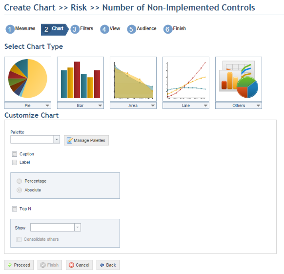
9. In the Select Chart Type section, select the type of chart you want to create. Note that the types available here vary according to the indicator selected. For details, see Chapter 9: Dashboard -> Chart Gallery -> Chart Types.
In the Customize Chart section, you can customize the chart according to the available options.
10. In the Palette section, select the color palette to be used by the chart. Click Manage Palettes to manage the palettes available.
The system displays a window where color palettes can be created, edited and deleted.
11. To create a new palette, click Create Palette.
The system displays an area where the properties and colors of the new palette can be defined (see figure below).
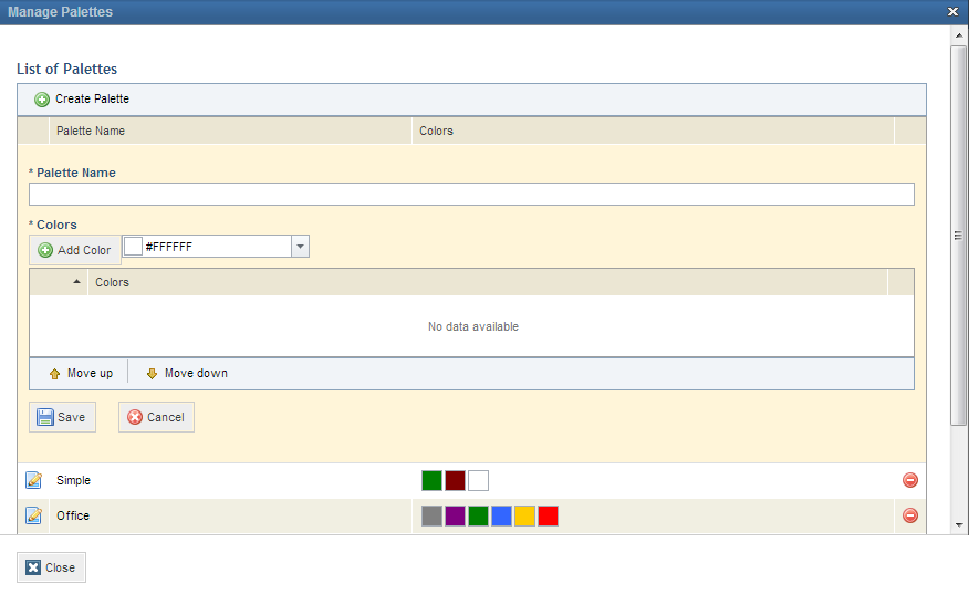
12. In the Palette Name field, enter a name for the new color palette using up to 200 characters.
13. In the Colors section, select a color from the drop-down list or enter the hexadecimal code of the color you want to add and click Add Color.
14. To rearrange the colors in the palette, click Move Up and Move Down.
15. To save the color palette, click Save.
16. To edit a
color palette, click Edit ( ) next to its name.
17. To delete a
color palette, click Delete ( ) next to its name. Note that
palettes are available to all users who have permission to create and edit
charts. In addition, if a palette that is being used in a chart is deleted, the
chart will revert to the default palette.
) next to its name. Note that
palettes are available to all users who have permission to create and edit
charts. In addition, if a palette that is being used in a chart is deleted, the
chart will revert to the default palette.
18. When finished customizing the color palettes, click Close.
19. Mark the Caption checkbox if you want an explanatory text to be displayed with the chart.
20. Mark the Label checkbox if you want the values for each item on the chart to be displayed. The Percentage and Absolute options allow you to choose how these values are displayed.
21. Mark the Top N checkbox if you want the objects with the highest values to be displayed. The number of objects to be displayed can be set in the Show field. The Consolidate others option allows objects not in the Top N to be consolidated.
22. Click Proceed to continue. To save the chart, click Finish. To return to the previous step, click Back. If you want to quit the operation, click Cancel.
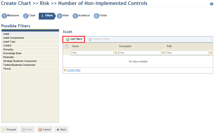
The system displays the Filters step, where the filters for the data to be displayed in the chart can be set. This step is optional.
23. In the Possible Filters section, select the filter you want to use for the chart data.
24. For each filter selected, objects can be added by clicking Add Filters (see figure below).
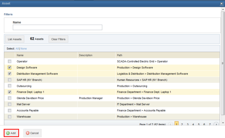
25. In the window that appears, select the objects to be added to the filter in the window that appears and click Add (see figure below).
The system displays the selected objects in the filter.
Note: The number of objects that can be included in a filter is limited to 1,000. If, for example, you choose to list all the organization’s assets and there are more than a thousand, the operation will not be performed.
26. To remove an object from the filter, mark the checkbox next to the object you want to remove and click Remove Filters.
27. Click Proceed to continue. To finish, click Finish. To return to the previous step, click Back. If you want to quit the operation, click Cancel.
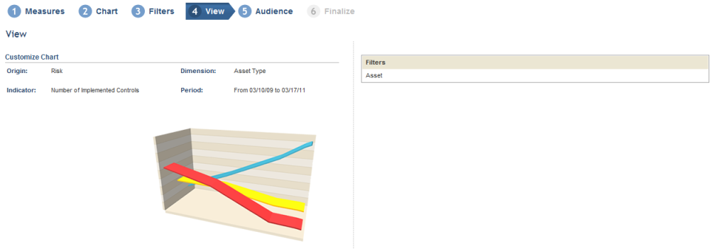
The system displays the View step, where you can view all the selected options (origin, indicator, dimension, period, filters, and type of chart) and preview a miniature of the chart (see figure below). This step is optional.
28. Click Proceed to continue. To finish, click Finish. To return to the previous step, click Back. If you want to quit the operation, click Cancel.
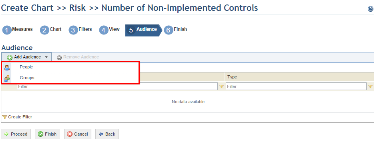
The system displays the Audience step, where you can select the people and groups of people authorized to view the chart, with the same permissions as the author, and add it to dashboards (see figure below). This step is optional. Keep in mind that these people and groups must be included in the Dashboard Module Users Profile in order to access the module.
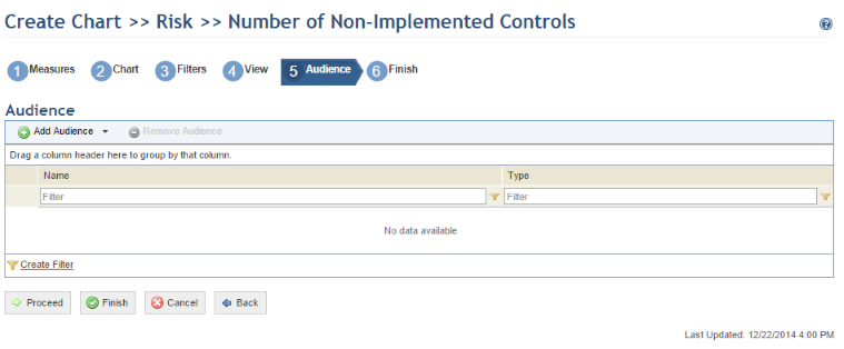
29. Click Add Audience and select People or Groups to add them (see figure below).
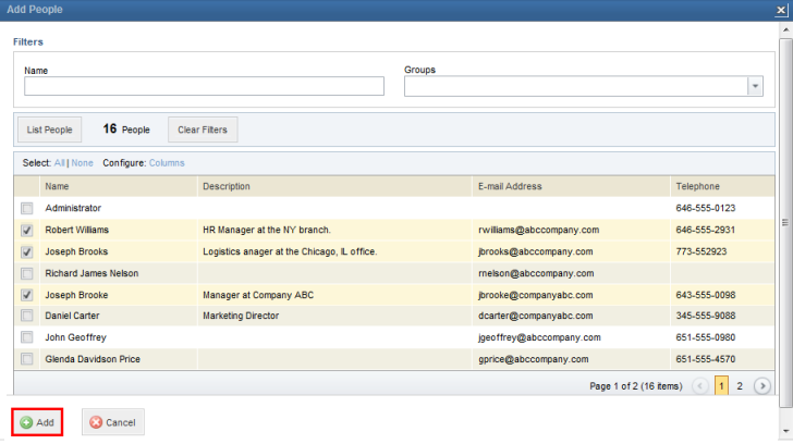
30. In the window that appears, select the people or groups to be added in the window that appears and click Add (see figure below).
The system displays the people selected.
31. To remove people from the audience, mark the checkboxes next to them and click Remove Audience.
32. Click Proceed or Finish to continue. To return to the previous step, click Back. If you want to quit the operation, click Cancel.
The system displays the Finish step, where you can specify the properties of the chart (see figure below).
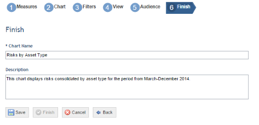
33. In the Chart Name field, enter a name for the chart using up to 200 characters.
34. In the Description field, provide additional information on the chart using up to 500 characters.
35. When finished, click Save. To return to the previous step, click Back. If you want to quit the operation, click Cancel.
The system displays a success message, and the new chart will be available in the Chart Gallery section of the Dashboard module.