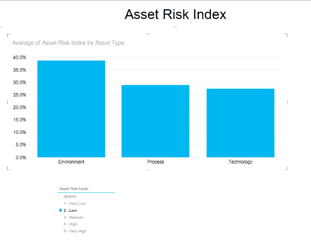
1. To highlight data from one chart using data from another chart, click one of the values from the first chart. Notice that the second chart will be filtered to only show data from the value selected in the first chart.
2. To create a slicer, click the blank part of the view so that none of the visualizations are selected. Select the chart that will be transformed into a slicer and click Slicer from the Design tab.
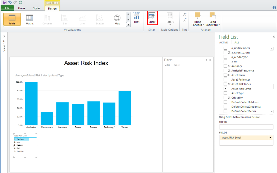
3. To create a second slicer, click the blank part of the view so that none of the visualizations are selected. Select the second chart that will be transformed into a slicer and click Slicer from the Design tab. The two slicers can be used to filter data from the main chart.
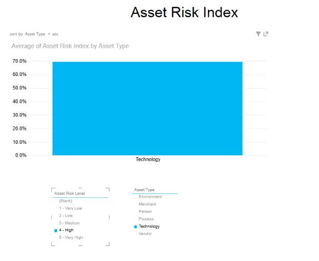
4. Note the behavior is different from highlighting in the chart. It filters everything in all the visualizations on the report, rather than just highlighting. For example, the first bar chart now just has one bar -- the asset type selected in the slicer. It also filters the items in the other slicer. If you select 4 – High in the Asset Risk Level slicer, then the Asset Type slicer will have only asset types with high risk levels.
5. To show all values again, click the Clear filter icon in the upper right corner of the slicer.
For more information, see Filtering, Highlighting, and Slicers in Power View.