1. Access the Dashboard module.
2. Select View Dashboards from the Dashboard Gallery option on the menu.
3. Select the dashboard you want to view from the menu.
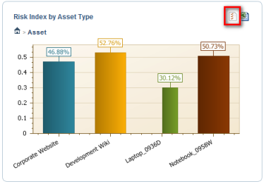
4. Click Customize Chart in the upper right corner of the chart (see figure below).
The system displays the available options to customize how the chart is displayed (see figure below).
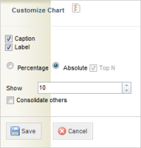
The options include:
•Caption: an explanatory text is displayed with the chart.
•Label: the values for each item on the chart are displayed.
•Percentage and Absolute: allows you to choose how the chart values will be displayed.
•Top N: displays the objects with the highest values. The number of objects to be displayed can be selected. The Consolidate others checkbox allows objects that are not part of the Top N to be consolidated.
5. When finished, click Save. If you want to quit the operation, click Cancel.