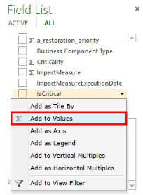
1. In the fields section of the field list, click the dropdown arrow next to one of the fields from one of the tables and click Add to Values.
2. The chart is now a stacked column chart, with the two values selected stacked on top of each other.
3. Click the dropdown arrow in the Visualizations gallery and click the Clustered Column chart.
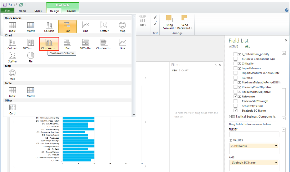
4. Now the two values selected are side by side.
5. Hover over the edge of the chart until the hand appears, and then drag the chart to the lower-right corner of the report.
6. Hover over the upper-right corner of the chart until the double-headed sizing arrows appear. Drag the sizing handle until the chart is half as tall as the view, and half as wide.