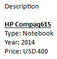
Dashboard Item
Image
Description
Pivot
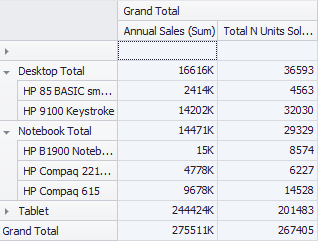
A multi-dimensional table that allows you to display more data relationships, commonly used in data with subgroups.
Grid
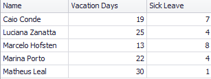
Displays tabular data arranged in rows and columns.
Chart
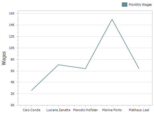
Graphically displays data using bars, lines, periods, etc.
Pies
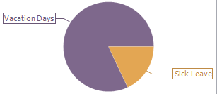
You can use pie or donut charts to represent the contribution of each value to a total.
Gauges
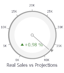
Gauges can display two values. One with the pointer and the other with a marker on the scale, indicating a variation between the current value and the target value.
Cards
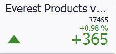
Cards show the difference between two values. This difference can be expressed in absolute values or as a percentage.
Choropleth Map
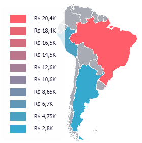
Allows you to color required areas in proportion to the provided values.
Geo Point Map
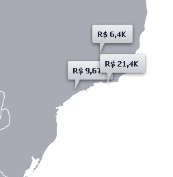
Allows you to highlight information on a map, such as geographic coordinates with balloons, circles, and pie charts.
Range Filter
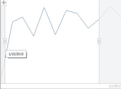
Use the filter to set time intervals and see only the data within the desired range.
Image
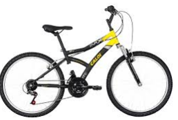
Use a static image to illustrate dashboard data.
Text Box
Allows you to include text, detailing the dashboard data.
Scatter Chart
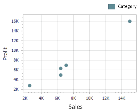
You can use scatter charts to analyze how one numeric variable affects another.